Never create an “AI flyer” without these 3 things
I would never make a flyer with AI without doing these 3 things
I would never make a flyer with AI without doing these 3 things.
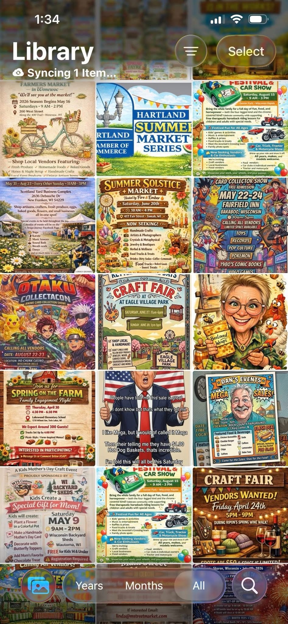
Everyone is noticing now that AI flyers are looking bad, and even flyers for legit events are starting to feel spammy. The issue is not that people are using AI. The issue is that a lot of AI flyer design looks like the AI was asked to do everything at once: write the copy, choose the hierarchy, pick the images, make the layout, render the text, and somehow understand what actually matters.
That is too much to ask from one prompt if you want a clean flyer. A good event flyer still needs editing, taste, restraint, and a real design pass. AI can help you move faster, but if you let it make every decision, you usually get that overloaded, glossy, weird-text, "why is there so much going on?" look.
Here’s what to do to help.
Why AI flyers are starting to look spammy
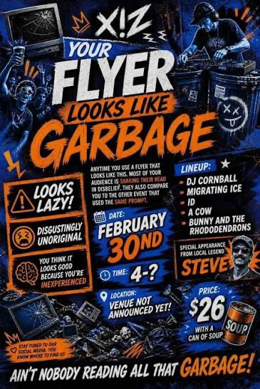
AI flyers often look spammy because they are trying to be impressive instead of clear. They have too many fonts, too many fake details, too much background noise, and too many tiny words nobody can read. The design ends up shouting at people instead of helping them understand the event.
The best flyer design usually has a clear job: get someone to understand what is happening, when it is happening, where it is happening, and why they should care. That is visual hierarchy. Canva has a helpful Canva visual hierarchy guide that explains why size, contrast, spacing, and order matter so much.
When an AI flyer ignores hierarchy, every part of the flyer competes for attention. The headline competes with the image. The date competes with fake decoration. The call to action gets buried under random badges. Even if the flyer looks colorful, the message feels messy.
That is why the first fix is not a better prompt. The first fix is usually less stuff.
1. Take the extra information out
A lot of these flyers have way too much stuff on them.
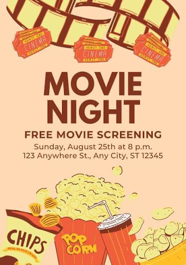
Ask the AI to reduce the amount of content, make the flyer more minimal, and only keep the most valuable information. If the flyer is for an event, the core information is usually simple: event name, short hook, date, time, location, price if needed, and one clear call to action.
Everything else has to earn its place.
If the AI gives you five slogans, three blocks of body text, a fake sponsor row, a badge, a mascot, four icons, and a bunch of decorative labels, cut it down. A flyer is not a full website. It is not a sales page. It is not a brochure. It is a quick visual.
The cleaner prompt is something like: "Make this flyer more minimal. Remove any unnecessary text. Keep only the event name, date, time, location, and one call to action. Use strong visual hierarchy and leave more whitespace."
That kind of direction matters because AI will often fill empty space by default. You have to tell it that empty space is allowed. Whitespace makes the important parts easier to read. It also makes the flyer feel more intentional and less like a generated ad.
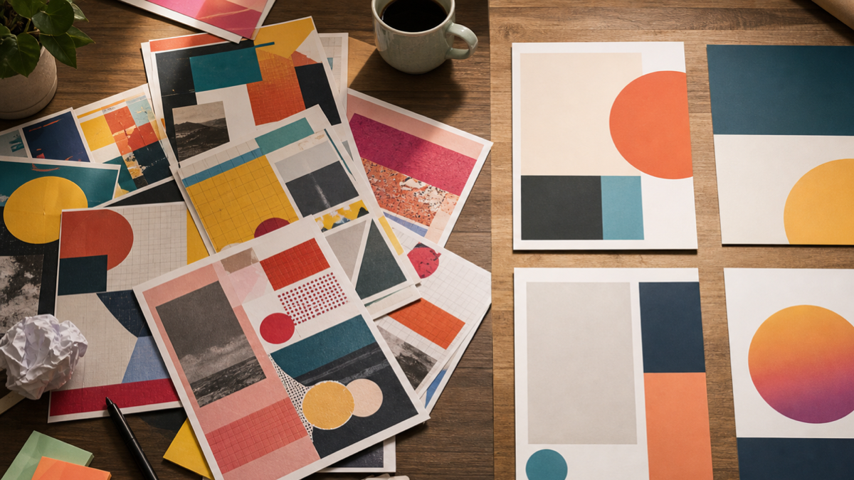
2. Use a reference point
Take the time to find some nice flyers that were handmade or manually created.
Then give those to the AI as a reference so the flyer looks better and the AI is not just making all these little design decisions on its own. This is one of the biggest upgrades you can make. A reference gives the AI a target for style, spacing, color, mood, and composition.
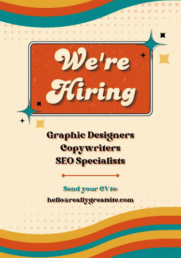
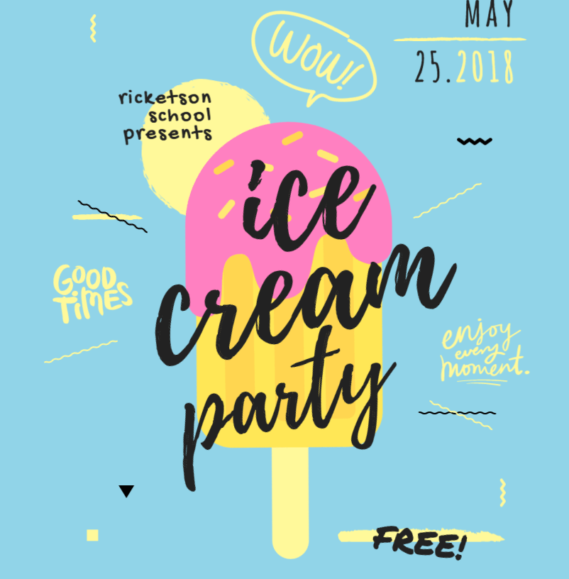
The reference does not have to match the exact event. It just needs to show the kind of design language you want. If you are making a jazz night flyer, find a strong music flyer. If you are making a local market flyer, find a clean market poster. If you are making a hiring flyer, find a simple recruiting poster with readable text and good spacing.
The point is to stop making the AI guess the whole taste direction from scratch. You can say: "Use this as a layout and mood reference, but make the flyer for my event. Keep the design simple, readable, and not too busy."
Good references help you avoid that generic AI flyer look where every design feels like the same loud template. They also help you notice what good flyers usually do: one dominant visual, a clear headline, limited font choices, strong contrast, and enough breathing room.
For more design basics, the Canva flyer design guide is a good resource, and the Adobe flyer design tips are useful if you want a more general design checklist.
3. Stop using AI to create the whole flyer
This is the tough one, but AI should be helping you create the flyer, the imagery, and most of the design. Prefer using real images though.
You should still go into Canva, Photoshop, Adobe Express, or another design app and build the rest of the flyer yourself. AI is good for exploration. It can help with mood, background imagery, layout ideas, color direction, and rough concepts. But the final flyer should still be edited like a real design.
AI still struggles with generating text right now, so the text is usually going to look better if you do it in Canva or another design program. This is the AI-generated text problem: event details have to be accurate. Dates, times, addresses, names, prices, and calls to action cannot be fuzzy.
Tools like the Canva flyer maker and Adobe Express flyer maker are useful because they let you place real editable text on top of the AI-assisted design. That means the flyer can still look creative, but the important information stays sharp and readable.
If you are using generative image tools, treat them like part of the process, not the whole process. Adobe explains this kind of generative workflow in its Adobe Firefly overview, and the Adobe Firefly text to image page is a good example of how AI can help generate imagery without replacing the entire design pass.
A better AI flyer workflow
Here is the workflow I would use if I wanted an AI flyer that did not look cheap.
First, write the real event information yourself. Do not make the AI invent details. Get the event name, date, time, location, price, link, and call to action correct before you start designing.
Second, collect two or three reference flyers. Pick references with clean hierarchy, readable text, and a style that fits your event. Do not just pick the loudest flyer. Pick the one that communicates well.
Third, ask AI for layout and image direction, not final text. Use it to generate a background, a concept, a rough composition, or visual ideas. Keep telling it to reduce clutter and simplify the design.
Fourth, rebuild the text in Canva, Photoshop, Adobe Express, Figma, or another design app. Use real text layers. Align things manually. Check spacing. Check contrast. Check mobile readability.
Fifth, export and test it where people will actually see it. If it is going on Instagram, look at it on your phone. If it is being printed, check the print size. If people cannot read the date and location in two seconds, the flyer is not done.
Quick checklist before you post
Before posting an AI flyer, I would check these things:
Can someone understand the event in three seconds? If not, simplify the headline and remove distractions.
Is the text real editable text? If the AI generated the letters, rebuild the text manually.
Is there one clear focal point? A flyer with five focal points usually has no focal point.
Did you use a reference? A good flyer reference can save you from a lot of random AI design choices.
Is the flyer readable on a phone? Most people will see it small, fast, and while scrolling.
Does it look like an intentional design, or does it look like an AI prompt result? That is the honest question.
Final thoughts
AI can absolutely help with flyer design, but it should not be treated like a magic one-click designer. The best results usually come from using AI for speed and exploration, then using your own judgment for the final edit.
Take the extra information out. Use a reference point. Stop using AI to create the whole flyer.
That simple shift can take an AI flyer from noisy and spammy to something that actually feels designed.
Let me know your thoughts.